

Google Tasks
Google Tasks
Created new User Experience
Created new User
Experience
The problem: The Google Tasks app has received numerous poor ratings on both the Play Store and App Store. User feedback from various platforms, including testimonials on YouTube and blog reviews, consistently highlight dissatisfaction with the app's overly simplistic features and the lack of advanced functionality. Users find the app limited in its capabilities, which affects its usability and overall effectiveness as a task management tool.
Duration: 5 week
My Role: UX/UI Designer/ UX Research/ Prototyping

Step 1
Project overview
Google Tasks is a task management app that lets you capture and edit your tasks. The app helps users manage their to-do lists, organizing them into categories, tasks, and subtasks. Its purpose is to take control of task management easily and efficiently.
Google Tasks is a task management app that lets you capture and edit your tasks. The app helps users manage their to-do lists, organizing them into categories, tasks, and subtasks. Its purpose is to take control of task management easily and efficiently.
User Survey
During the discovery phase of my project, I carried out a user survey targeting the intended audience to gain a deeper understanding of their challenges. The insights gathered from this survey allowed me to pinpoint the specific pain points that users were encountering. Initially, I approached the research with a series of assumptions, but these evolved as I gained a clearer picture of the users' needs and experiences.
During the discovery phase of my project, I carried out a user survey targeting the intended audience to gain a deeper understanding of their challenges. The insights gathered from this survey allowed me to pinpoint the specific pain points that users were encountering. Initially, I approached the research with a series of assumptions, but these evolved as I gained a clearer picture of the users' needs and experiences.
Play Store and App Store Reviews
To understand more what the app is lacking, I also read and analyzed Google Tasks ratings and reviews on Google’s Play Store and Apple’s App Store.
To understand more what the app is lacking, I also read and analyzed Google Tasks ratings and reviews on Google’s Play Store and Apple’s App Store.

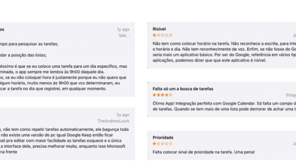
Pain points UI looks outdated and unattractive Users are unable to find tasks easily They find it’s hard to keep multiple lists organized They miss a list collaboration function The app lacks reminders and location reminder The app lacks voice input.
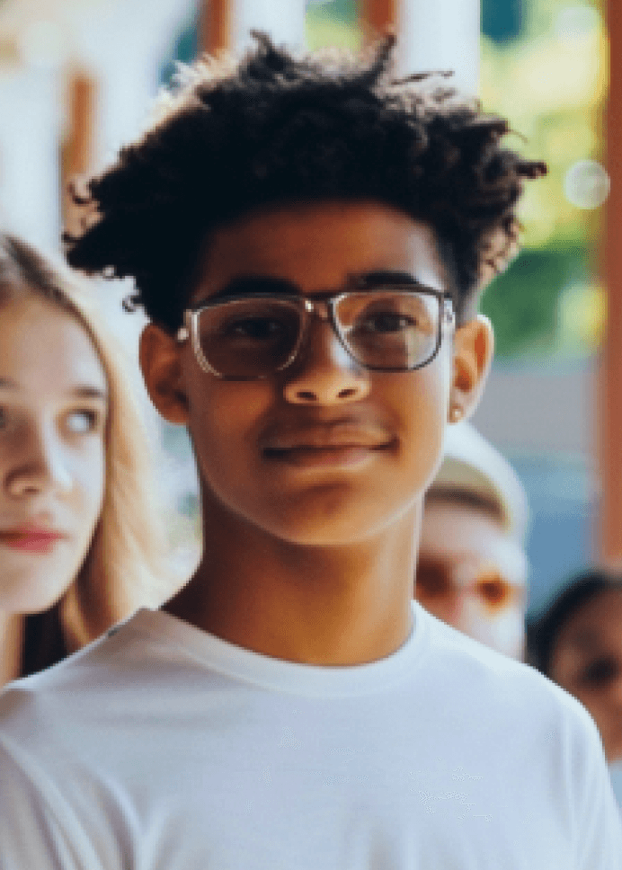
Alex
Age: 22
Occupation: Project Manager
Location: New York, NY
Family: Married, 0 children
Goals:
Organize tasks effectively to meet deadlines.
Balance work and family time.
Frustrations:
Struggles with the lack of advanced task management features.
Finds it hard to keep track of long-term projects.
About: Alex is a project manager working in a fast-paced tech company. He manages multiple projects simultaneously and often finds himself overwhelmed by the volume of tasks. Alex is looking for a task management tool that offers advanced features like project tracking, reminders, and collaboration options to streamline his workflow and ensure he has time for his family.
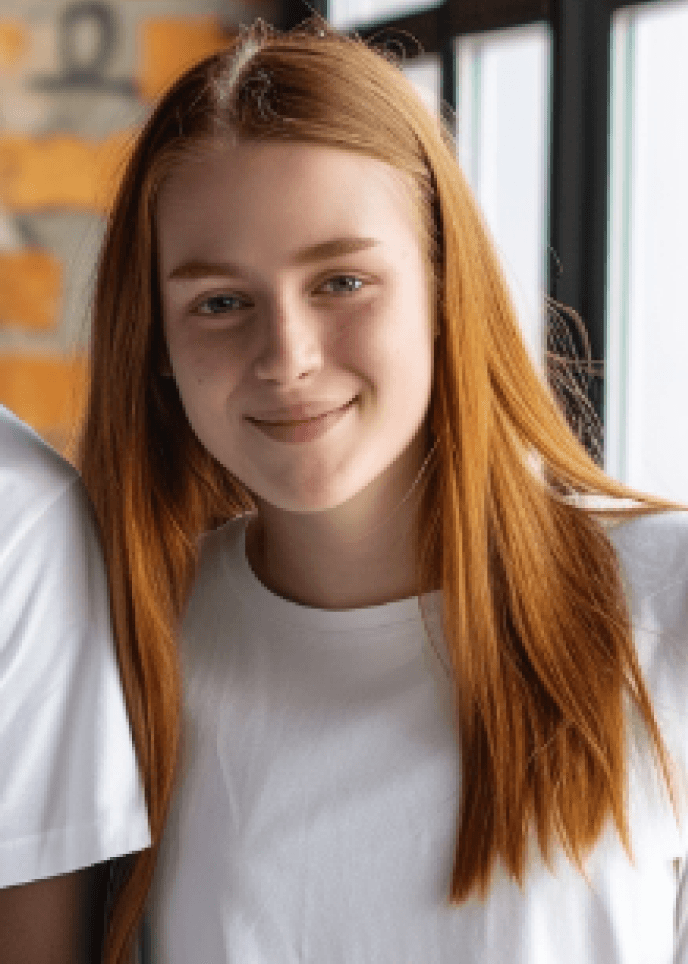
Maria
Age: 23
Occupation: Freelance Graphic Designer
Location: San Francisco, CA
Family: Single
Goals:
Keep track of multiple freelance projects.
Ensure timely delivery of client work.
Frustrations:
Overly simplistic task management apps that lack customization.
Difficulty in managing overlapping deadlines.
About: Maria is a 23-year-old freelance graphic designer who juggles multiple projects for different clients. She needs a task management app that is simple yet customizable, allowing her to organize her tasks, set deadlines, and prioritize her work efficiently. Maria often feels that current apps are either too basic or too complex for her needs.
User Persons
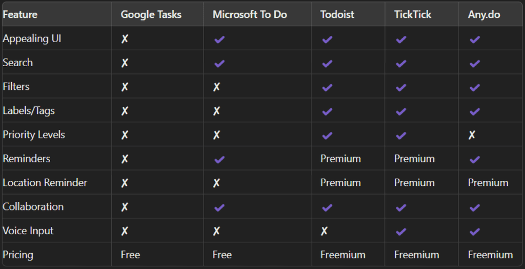
Before diving into sketching and wireframing, I conducted a comprehensive competitive analysis to identify key competitors and understand the most common functionalities in task management apps. This analysis helped highlight the strengths and weaknesses of Google Tasks in comparison to its competitors.

By analyzing the competition, I identified several areas where Google Tasks could be improved. The app lacks essential features such as advanced search, filters, labels, and collaboration options that are commonly found in other popular task management apps.
This insight was crucial in guiding the design and development of new features to enhance the user experience and competitiveness of Google Tasks.
Step 2
Starting the design
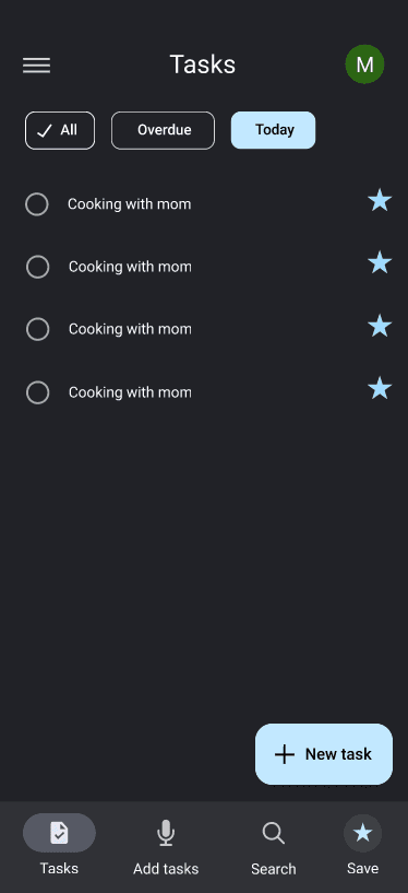
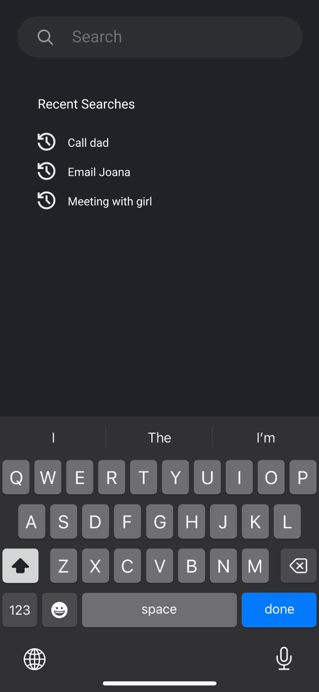
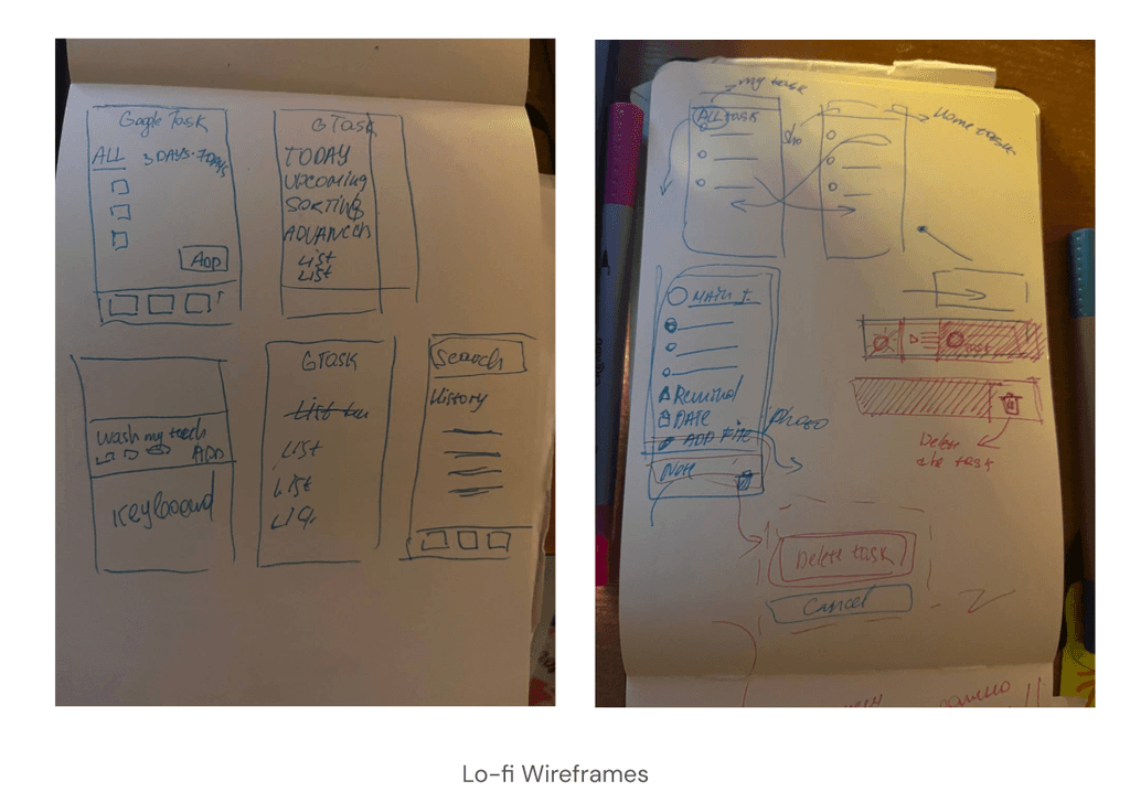
At the onset of my design process, I sketched several interface concepts to establish a foundational understanding of the app's functionality. My initial wireframes included features that allowed users to easily view tasks for the current day and upcoming days. Additionally, I incorporated options for users to view tasks for the next three or seven days. I also added a search bar and voice input functionality to enhance usability. These sketches provided a basic structure and helped me visualize the app's core features. Later, using Figma, I further refined these concepts and developed additional features to improve the app's overall functionality.
I started designing a UI screens in Figma.
Complete the process within a few steps
Easily organize
and schedule tasks
Redesigned a task management app to ensure seamless, intuitive interactions, allowing users to effortlessly organize and manage their tasks
Improving productivity, one task at a time.
At the onset of my design process, I sketched several interface concepts to establish a foundational understanding of the app's functionality. My initial wireframes included features that allowed users to easily view tasks for the current day and upcoming days. Additionally, I incorporated options for users to view tasks for the next three or seven days. I also added a search bar and voice input.
Step 3
Refining the Design
After developing the initial designs in Figma, I delved into Google Material Design 3 to refine my final screens. You can explore Material Design 3 here: Material Design 3.
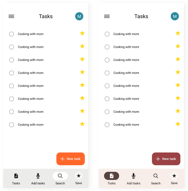
Inspired by the design standards of Google Apps, I aimed to align my redesign with Google's visual and functional guidelines. This involved maintaining consistent color schemes, typography, and user interface elements similar to other Google applications.
Initial Screen
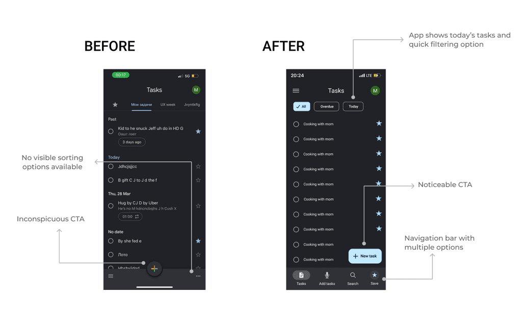
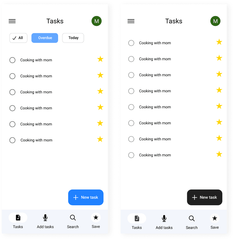
My first objective was to enhance the user experience when launching the app. The initial screenshot (before) reveals a lack of options for users to quickly get an overview of their to-do list. The updated design (after) introduces an improved user interface, featuring more prominent call-to-action buttons, and added sorting and filtering functionalities.
After developing the initial designs in Figma, I delved into Google Material Design 3 to refine my final screens. You can explore Material Design 3 here: Material Design 3.
Inspired by the design standards of Google Apps, I aimed to align my redesign with Google's visual and functional guidelines. This involved maintaining consistent color schemes, typography, and user interface elements similar to other Google applications.
InitiScreenal
My first objective was to enhance the user experience when launching the app. The initial screenshot (before) reveals a lack of options for users to quickly get an overview of their to-do list. The updated design (after) introduces an improved user interface, featuring more prominent call-to-action buttons, and added sorting and filtering functionalities.
Initial Screen
My first objective was to enhance the user experience when launching the app. The initial screenshot (before) reveals a lack of options for users to quickly get an overview of their to-do list. The updated design (after) introduces an improved user interface, featuring more prominent CTA (call-to-action) buttons, and added sorting and filtering functionalities.

The "before" screen shows limited functionality with no visible sorting options and an inconspicuous call-to-action button. The "after" screen, on the other hand, highlights the following improvements:
Display of today's tasks and quick filtering options.
More noticeable call-to-action buttons.
Enhanced navigation bar with multiple options.
Sorting options easily accessible.
Navigation
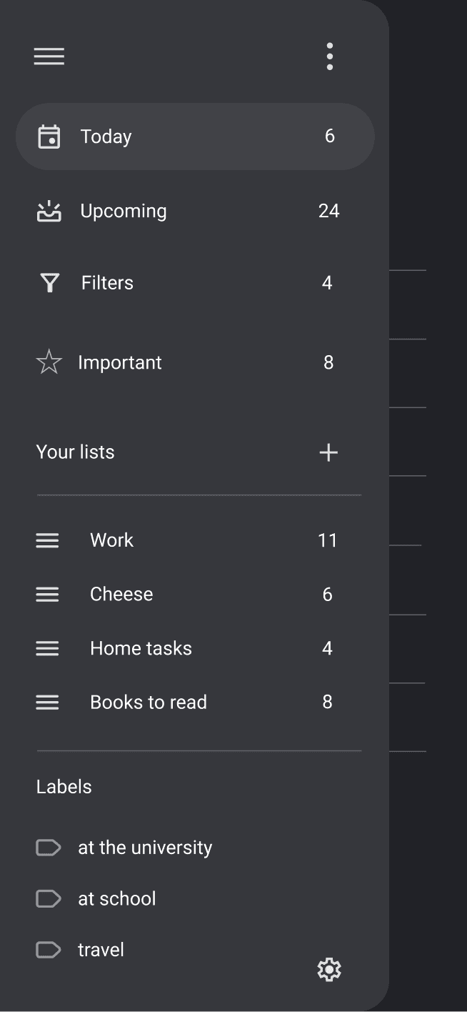
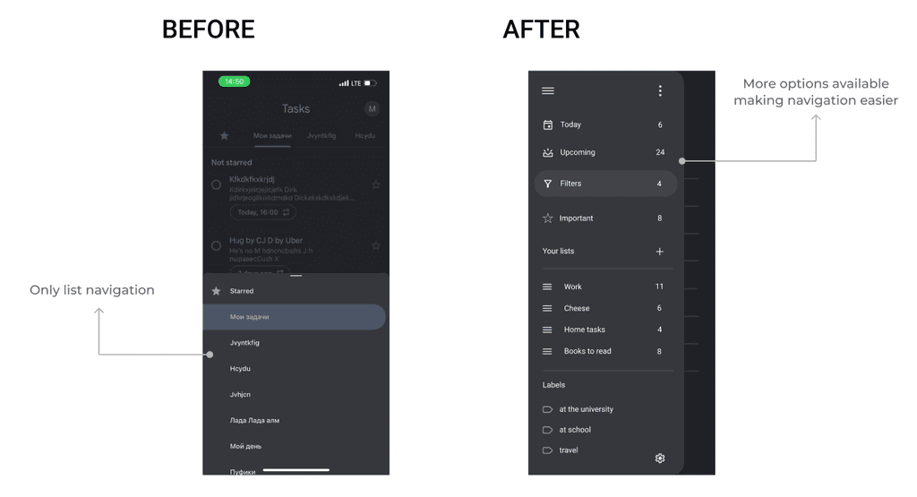
My next step was to redesign the navigation experience to improve usability and accessibility. The initial navigation setup was limited, offering only a basic list navigation feature, which made it difficult for users to manage their tasks efficiently.
The "before" screenshot illustrates the original navigation bar, which provided very few options. In contrast, the "after" screenshot showcases a redesigned navigation drawer that includes quick actions for users to manage their lists easily.
Add a tasks
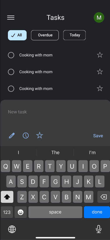
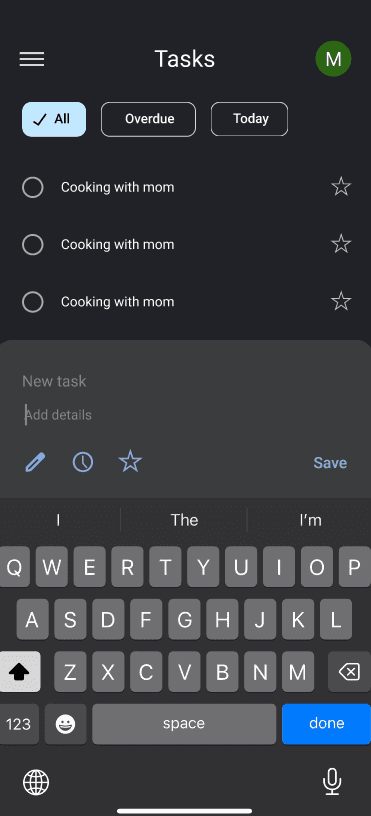
The next aspect I focused on was redesigning the task addition options to enhance user functionality. The previous interface had limited options, restricting users to basic task entries. Based on the person as identified earlier, I expanded the task addition functionality.
The next aspect I focused on was redesigning the task addition options to enhance user functionality. The previous interface had limited options, restricting users to basic task entries. Based on the person as identified earlier, I expanded the task addition functionality.

Key improvements in the new task addition design:
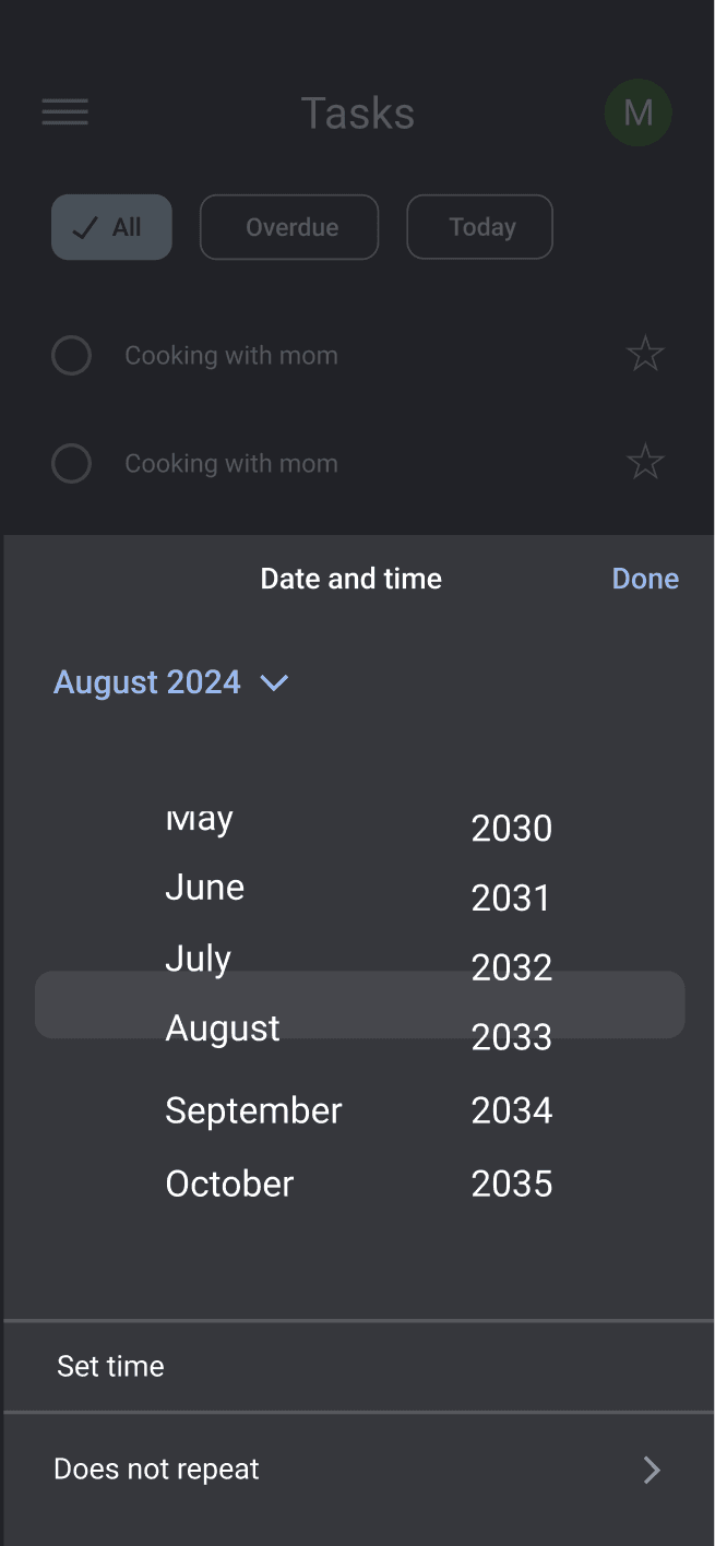
More Options: Added functionality to include due dates, assign tasks to specific lists, add labels, set priority levels, and create reminders, offering users greater flexibility and control over their tasks.
Enhanced Input Field: Improved the input field for task details, making it more intuitive and user-friendly.
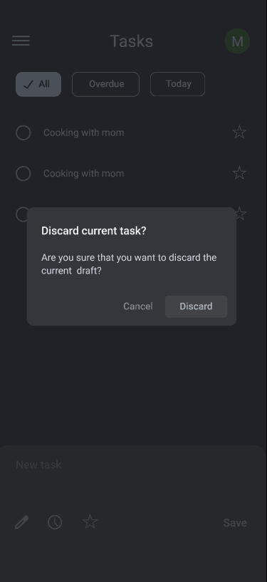
Confirmation Dialogs
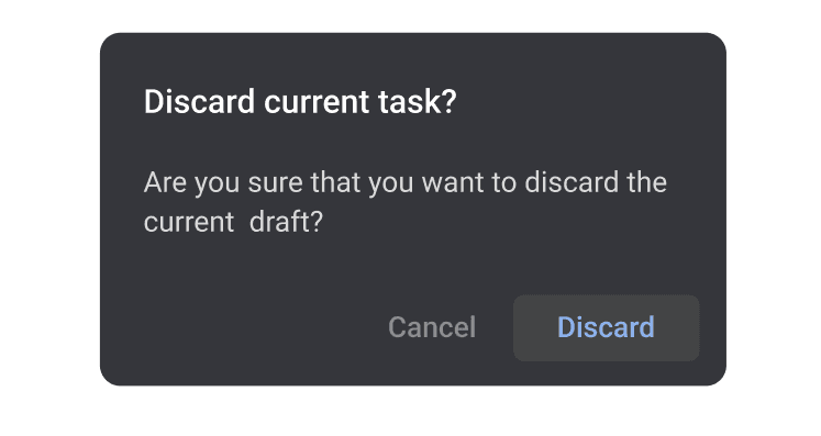
Additionally, I added confirmation dialogs for critical actions such as deleting or discarding tasks. Previously, the app would immediately delete items without any prompt, which could lead to accidental data loss. Now, users receive a confirmation dialog before such actions, reducing the risk of mistakes and enhancing data security.
Inside a list
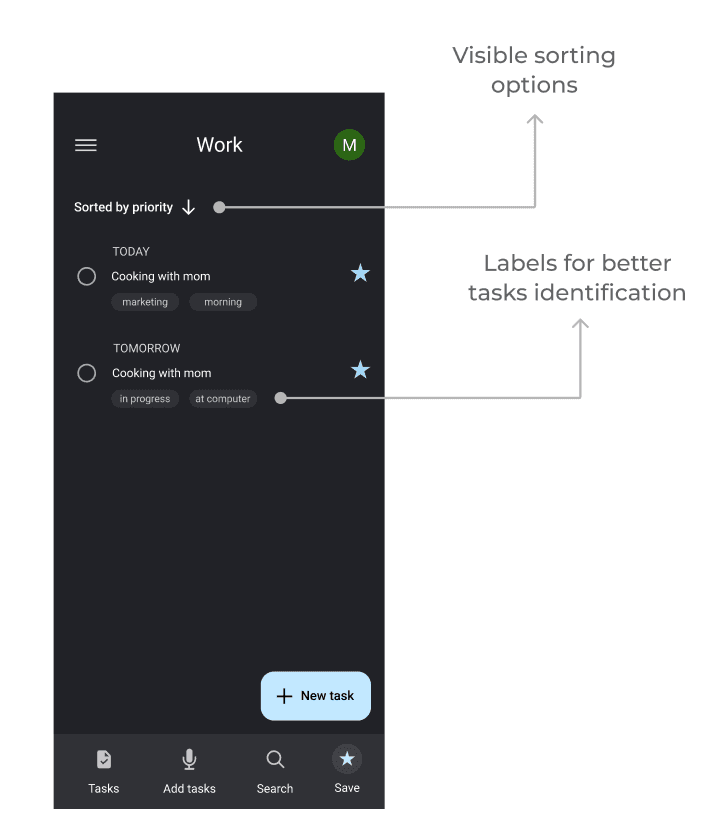
In my redesign, when the user is in a list they have more options for sorting and quickly identifying their todo list based on sorting options and label identification.
Accessibility Considerations
In designing the app, I prioritized accessibility to ensure it is user-friendly for a diverse audience. I kept the interface clean and intuitive, with clear visual cues and concise text to make navigation straightforward. Combining text with a well-organized menu helps users quickly find what they need.
The navigation flow was designed to be simple, with minimal steps and clearly labeled controls that are easy to locate. I also included voice input functionality, not only to assist users who prefer voice commands but also to expedite the task entry process. Utilizing Google Material Design 3, I ensured that the design adhered to the highest accessibility standards, facilitated by the comprehensive guidelines and tools provided in the Figma kit.
By focusing on these accessibility elements, I aimed to create an inclusive and efficient user experience that caters to all users, making the app both practical and enjoyable to use.
Step 4
Going forward
The first challenge was understanding the users, which I addressed by conducting thorough research. Following this, I translated my ideas into wireframes, bringing the initial concepts to life.
One of the most valuable lessons was learning best practices within the Google design system. I dedicated significant time to studying Material Design 3, which proved to be incredibly beneficial. Google's comprehensive resources provided me with the essential knowledge to design with a user-centric approach.
In terms of user research, ideally, I would have utilized data analytics to gain deeper insights into user behavior. However, since this redesign project was conducted independently and without affiliation with Google, I was limited in my access to relevant data.
Thanks for your attention!

Easy booking flow
Hi-Fi Prototype
In the prototyping phase, my goal was to transform the initial sketches and wireframes into interactive, high-fidelity prototypes. These prototypes were crucial for validating design concepts and for further testing.

Redesigned a task management app to ensure seamless, intuitive interactions, allowing users to effortlessly organize and manage their tasks
Improving productivity, one task at a time.


Before diving into sketching and wireframing, I conducted a comprehensive competitive analysis to identify key competitors and understand the most common functionalities in task management apps. This analysis helped highlight the strengths and weaknesses of Google Tasks in comparison to its competitors.
Pain points UI looks outdated and unattractive Users are unable to find tasks easily They find it’s hard to keep multiple lists organized They miss a list collaboration function. The app lacks reminders and location reminder The app lacks voice input.

Alex

Alex
About: Alex is a project manager working in a fast-paced tech company. He manages multiple projects simultaneously and often finds himself overwhelmed by the volume of tasks. Alex is looking for a task management tool that offers advanced features like project tracking, reminders, and collaboration options to streamline his workflow and ensure he has time for his family.
Age: 22
Occupation: Project Manager
Location: New York, NY
Family: Married, 0 children
Goals:
Organize tasks effectively to meet deadlines.
Balance work and family time.
Frustrations:
Struggles with the lack of advanced task management features.
Finds it hard to keep track of long-term projects.
User Persons

Maria

Maria
About: Maria is a 23-year-old freelance graphic designer who juggles multiple projects for different clients. She needs a task management app that is simple yet customizable, allowing her to organize her tasks, set deadlines, and prioritize her work efficiently. Maria often feels that current apps are either too basic or too complex for her needs.
Frustrations:
Overly simplistic task management apps that lack customization.
Difficulty in managing overlapping deadlines.
Age: 23
Occupation: Freelance Graphic Designer
Location: San Francisco, CA
Family: Single
Goals:
Keep track of multiple freelance projects.
Ensure timely delivery of client work.
Step 2
Starting the design
At the onset of my design process, I sketched several interface concepts to establish a foundational understanding of the app's functionality. My initial wireframes included features that allowed users to easily view tasks for the current day and upcoming days. Additionally, I incorporated options for users to view tasks for the next three or seven days. I also added a search bar and voice input functionality to enhance usability. These sketches provided a basic structure and helped me visualize the app's core features. Later, using Figma, I further refined these concepts and developed additional features to improve the app's overall functionality.


I started designing a UI screens in Figma.


At the onset of my design process, I sketched several interface concepts to establish a foundational understanding of the app's functionality. My initial wireframes included features that allowed users to easily view tasks for the current day and upcoming days. Additionally, I incorporated options for users to view tasks for the next three or seven days. I also added a search bar and voice input


Key improvements in the new task addition design:
More Options: Added functionality to include due dates, assign tasks to specific lists, add labels, set priority levels, and create reminders, offering users greater flexibility and control over their tasks.
Enhanced Input Field: Improved the input field for task details, making it more intuitive and user-friendly.
Confirmation Dialogs
Additionally, I added confirmation dialogs for critical actions such as deleting or discarding tasks. Previously, the app would immediately delete items without any prompt, which could lead to accidental data loss. Now, users receive a confirmation dialog before such actions, reducing the risk of mistakes and enhancing data security.


Inside a list
In my redesign, when the user is in a list they have more options for sorting and quickly identifying their todo list based on sorting options and label identification.


Hi-Fi Prototype
In the prototyping phase, my goal was to transform the initial sketches and wireframes into interactive, high-fidelity prototypes. These prototypes were crucial for validating design concepts and for further testing.
Accessibility Considerations
In designing the app, I prioritized accessibility to ensure it is user-friendly for a diverse audience. I kept the interface clean and intuitive, with clear visual cues and concise text to make navigation straightforward. Combining text with a well-organized menu helps users quickly find what they need.
The navigation flow was designed to be simple, with minimal steps and clearly labeled controls that are easy to locate. I also included voice input functionality, not only to assist users who prefer voice commands but also to expedite the task entry process. Utilizing Google Material Design 3, I ensured that the design adhered to the highest accessibility standards, facilitated by the comprehensive guidelines and tools provided in the Figma kit.
By focusing on these accessibility elements, I aimed to create an inclusive and efficient user experience that caters to all users, making the app both practical and enjoyable to use.
Step 4
Going forward
The first challenge was understanding the users, which I addressed by conducting thorough research. Following this, I translated my ideas into wireframes, bringing the initial concepts to life.
One of the most valuable lessons was learning best practices within the Google design system. I dedicated significant time to studying Material Design 3, which proved to be incredibly beneficial. Google's comprehensive resources provided me with the essential knowledge to design with a user-centric approach.
In terms of user research, ideally, I would have utilized data analytics to gain deeper insights into user behavior. However, since this redesign project was conducted independently and without affiliation with Google, I was limited in my access to relevant data.
